Outline
This case study illustrates the design process of a mobile app for delivery drivers. The app's primary goal is to provide a streamlined and efficient experience for delivery drivers while enabling them to manage their deliveries effectively.
COMPANY PROFILE
Onfleet is the trusted last mile delivery solution for thousands of companies across dozens of industries including food and beverage, retail, e-commerce, furniture, pharmacy and more. The SaaS was a dashboard for Dispatchers and a Drivers app on Android and iOS. I was the first dedicated Product Designer on the mobile squad. improving the experience for drivers.
process
The first step was to conduct research on the target user group, which was delivery drivers employed by the organizations that used the dashboard. The research involved studying delivery drivers' pain points, preferences, and requirements to design features that support their needs. I worked closely with the UX Researcher to initiate user research. Working with the PM, we synthesized findings from the user research, my audit and data pulled from Amplitude and ProductBoard to determine the priority levels of each feature.
The first task we took on was feature parity. We wanted to bring some cohesion to the two apps. I was the first dedicated UX Designer on the squad; the devs had worked independently for four years. There were a lot of discrepancies in the flows on both platforms. To start, I performed an audit. I would test any differences I found in the platforms on both iOS and Android and determine which platform had better usability. From there, I designed a new flow for the other platform utilizing native components for that specific OS. I would often take pieces from each, add my tweaks, and create a new flow.
Alongside the audit, the PM, UX Researcher, and I conducted user research interviews with a small group of drivers. This process provided valuable information on their pain points and how we could improve their experience with the app. Working with the PM, we synthesized findings from these two sources with data pulled from Amplitude and ProductBoard to determine priority levels of each feature we wanted to work on. The audit and interviews provided a jumping-off point for determining what features to work on next.
01 linked tasks
Creating a flow to help drivers identify when there are multiple tasks
The dispatchers were able to combine tasks; the purpose was to handle multi-stop deliveries, i.e., pick-up from point A and drop-off at point B. The issues: tasks weren't visually linked for the drivers, and the tasks could be claimed individually in the Unassigned category. The first step was to create logic that a linked task could be claimed without its parent/child. We then created a visual indicator to showcase to drivers there were multiple tasks involved. This was especially important in Unassigned as the driver would need to know the amount of work they assigned themselves. This scenario's difficulty was sorting and presenting the Unassigned and Today tasks.
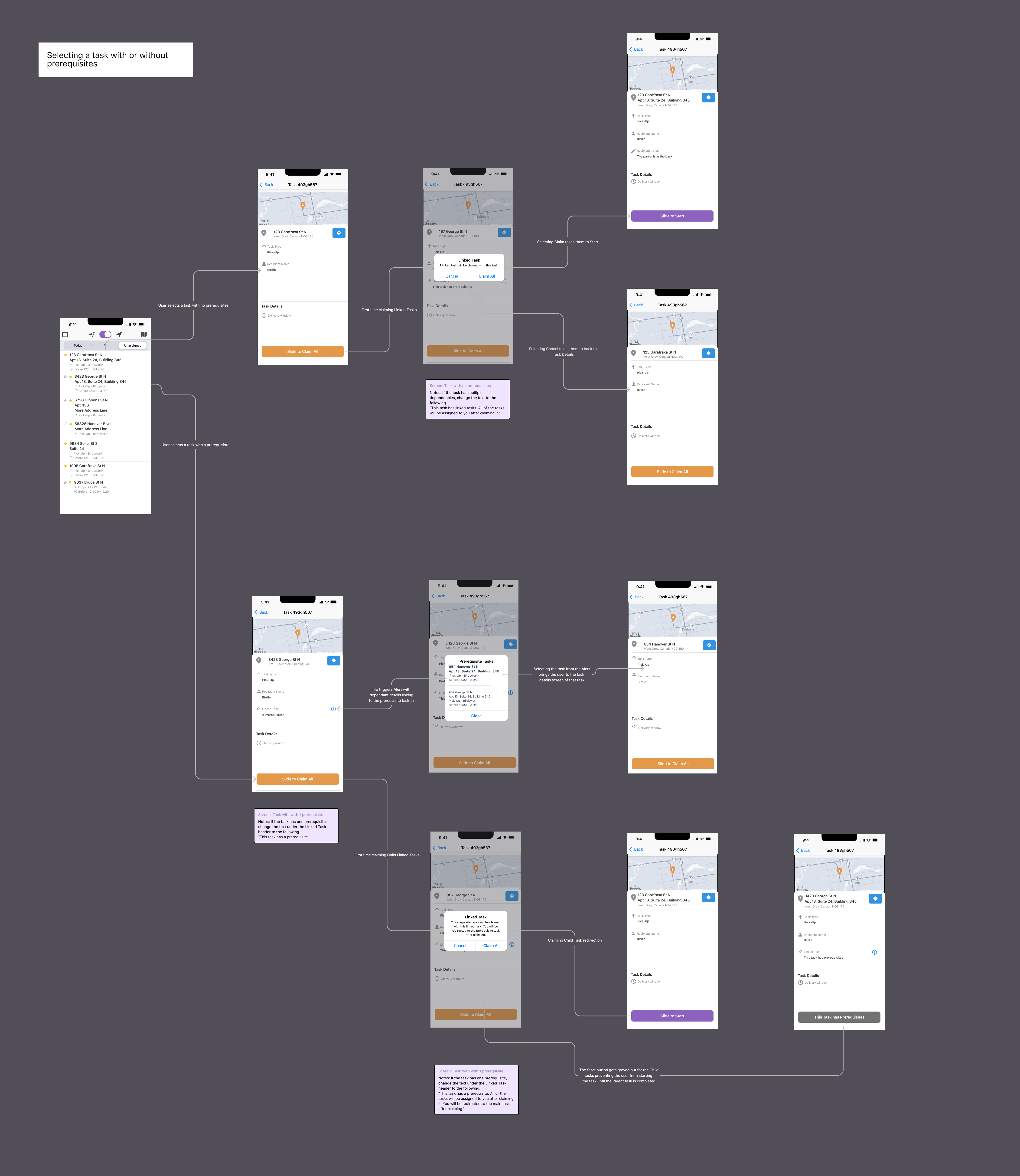
1.1 iOS Wireflows for final iteration of Linked tasks
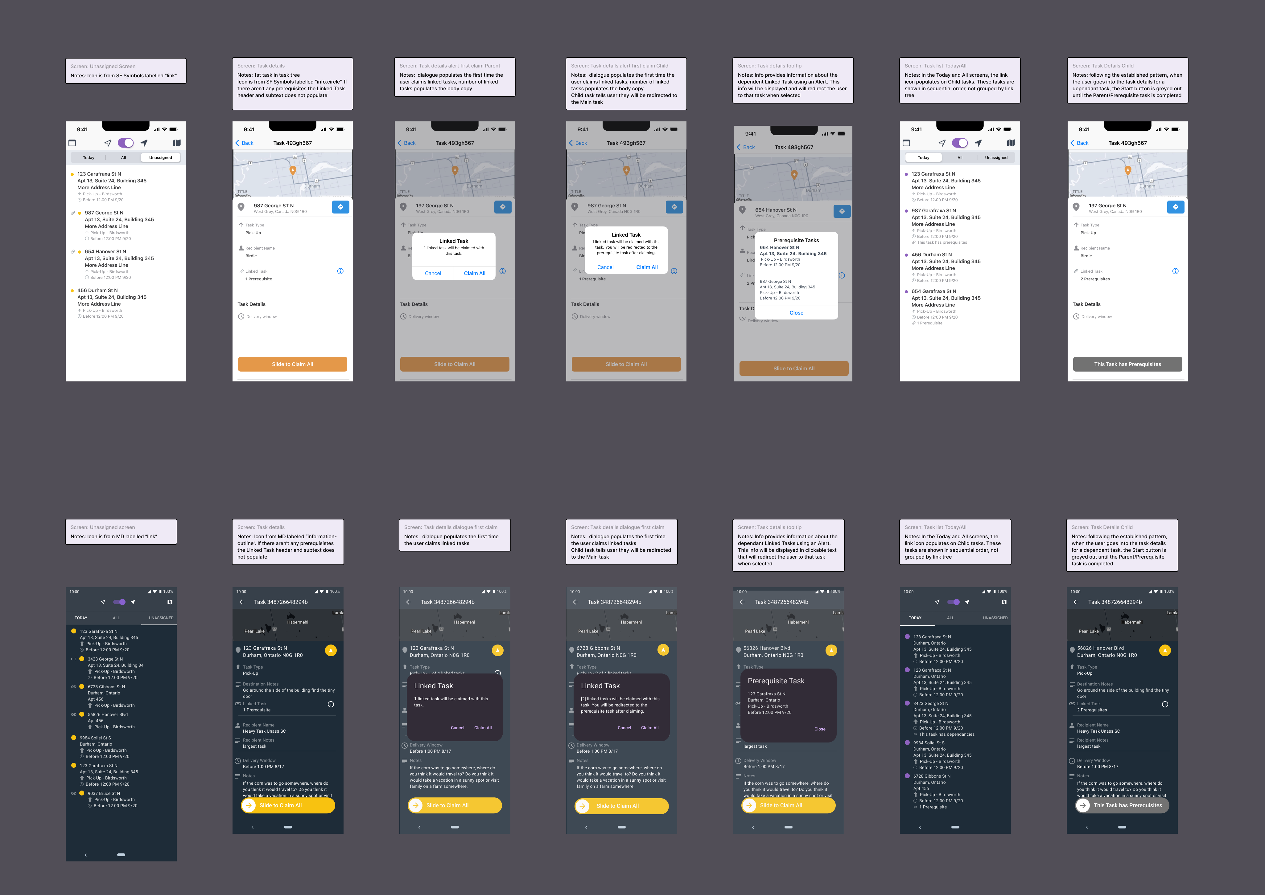
1.2 iOS & Android screens for Linked tasks
02 account deletion
designing a flow to allow users to permanently delete their accounts
Comparative/Field analysis: every app analyzed had a scheduling/calendar function, but didn’t offer any much-needed suggestions or prompts. The lacking feature would leave the user confused and second-guessing how to water their specific plant. There needed to be more intuitive features built-in for this app to serve its purpose of reducing cognitive load and alleviate stress.
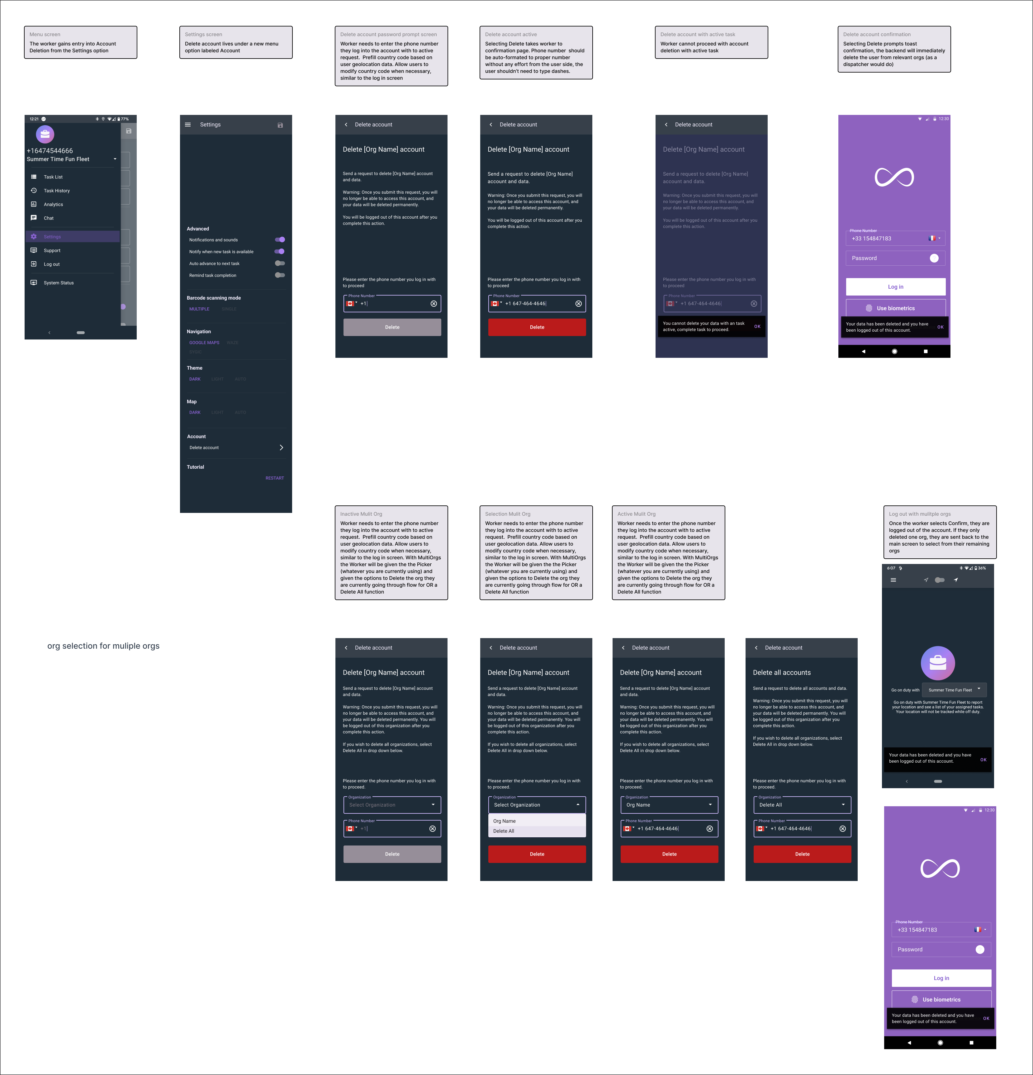
2.1 Android Account Deletion screens
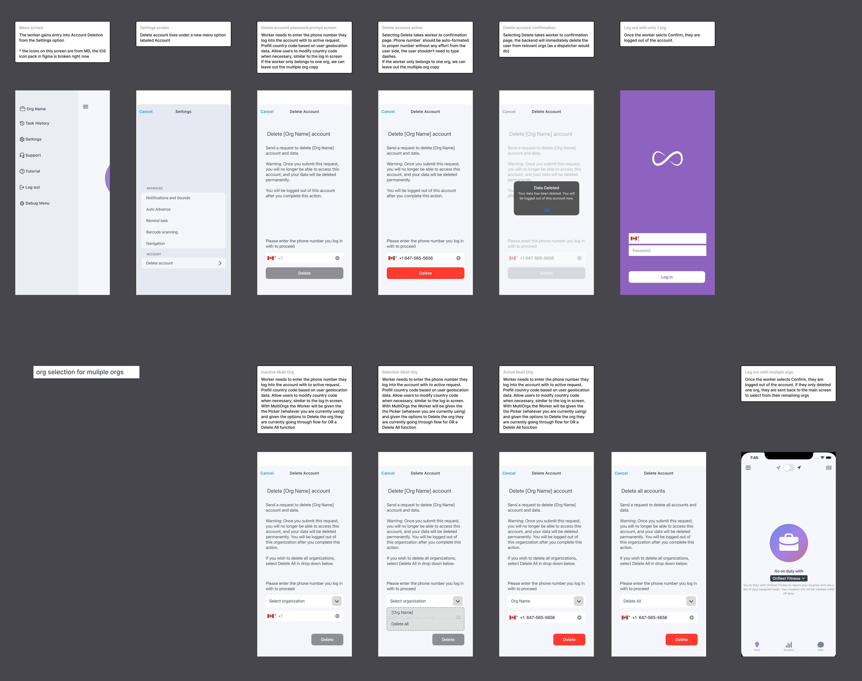
2.2 Android Account Deletion screens
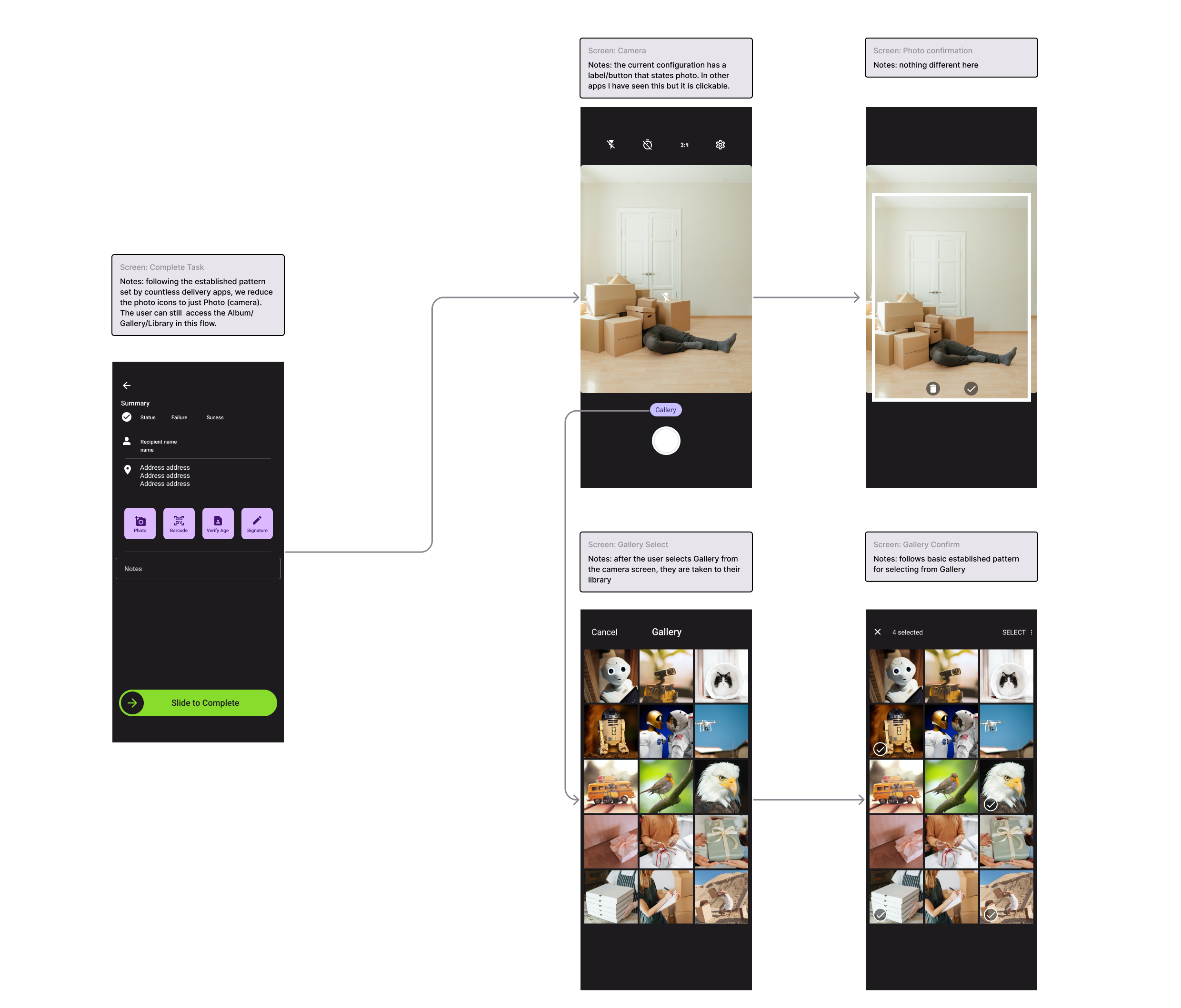
03 photo picker
designing a more robust way to add photos
I created User Flows for a few critical tasks to ascertain what steps the user must take before creating the architecture of the app.
Designing a sitemap helped me organize information and discover which features would be an asset to create the journey intended for the user.
Aligning with my persona and goals, I determined the features to be included needed to be:
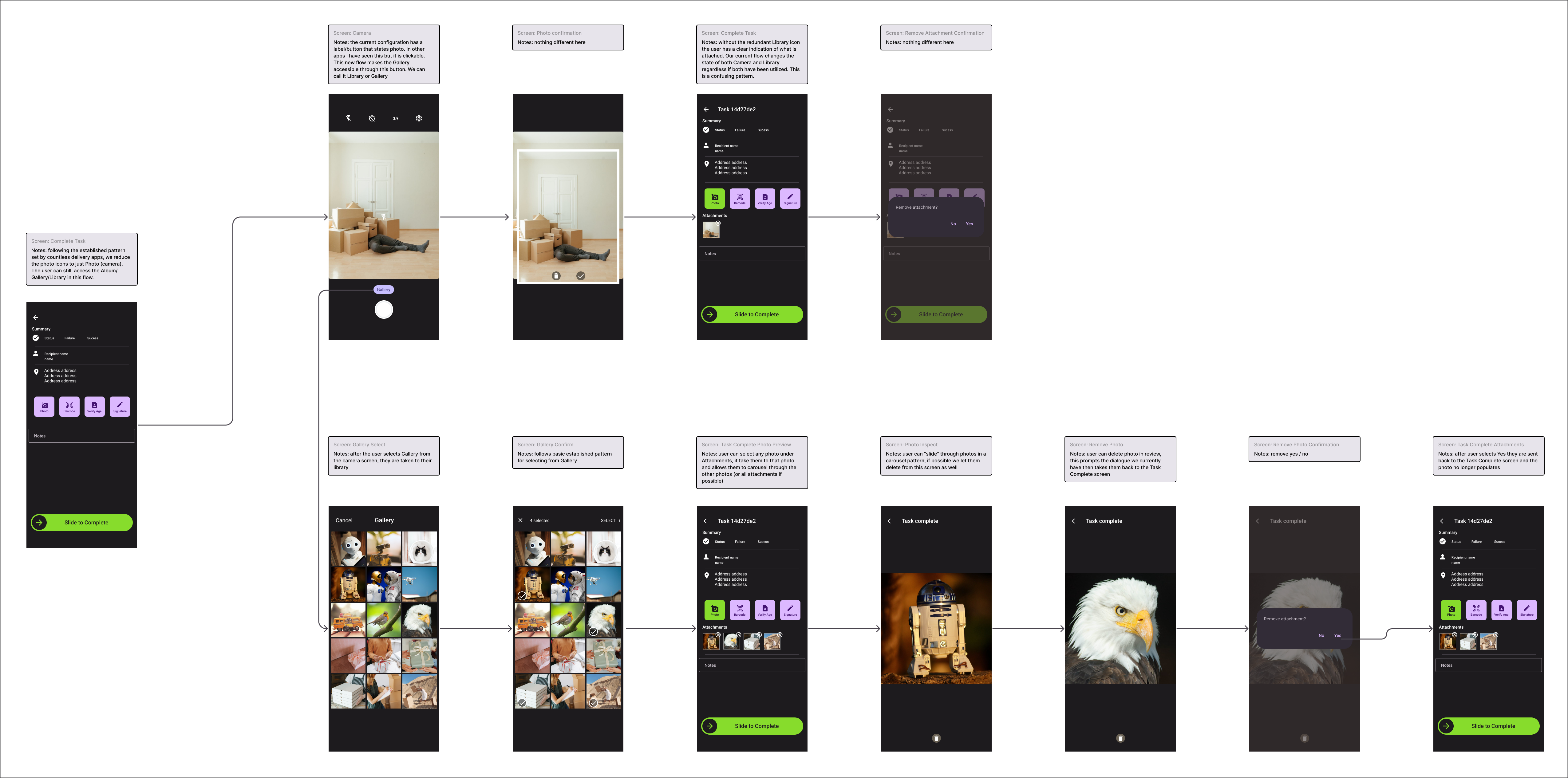
3 Photo Selector wireflows
conclusion
During my time on the mobile squad, we saw significant app advancements. We started the first research on the drivers. I helped to create a cohesive process for the squad to follow. My most meaningful payoff was improving the working conditions for the stressful delivery driving job.