Outline
These are components of my work with a company that has a well-established brand identity and is expanding into the enterprise market. As part of this expansion, we were introducing a new product to complement their primary SaaS offering. This company provides a reliable last-mile delivery solution for thousands of businesses across various industries, such as food and beverage, retail, e-commerce, furniture, and pharmacy. Below are some examples of the brand design materials I created to launch this new product.
01 brand audit
Exploring and documenting established brand system
To understand the brand, I conducted a thorough audit to define the company's brand identity. I created a comprehensive Figma file to capture all the essential assets, providing a valuable reference for all future work. In close collaboration with the brand manager, we proactively developed an official style guide. This guide gave multiple teams clear and concise guidelines, ensuring consistency, professionalism, and alignment with the company's mission and values in all branding efforts. The guide reduced the cognitive load for our UX and Marketing teams.

1.1 Brand mapping

1.2 Company's established colour palette
02 Logo
Designing a new logo for a sister project that aligns with established visual identity
After finishing the discovery work, I designed a logo for a new supplementary service. The service intended to connect organizations in a supply-and-demand model, and the logo had to convey a feeling of connection and community among these companies.
I began by sketching out various concepts. I initially explored a wide range of ideas and eventually chose one concept to work with in AI using the original logo's SVG. I produced multiple versions, adjusting each one until it achieved the desired vibe specified by the stakeholders.
I created three concepts to present to the stakeholders. The first focused on the connection between the delivery companies, the second highlighted the driving aspect of the side project, and the third was based on the stakeholders' suggestions.
The connection-focused logo was the most successful. It retained the original logo while incorporating dots to signify the connection between companies. The variation in dot size created a visual flow between supply and demand partners. Dots are also often commonly used in wayfinding designs.
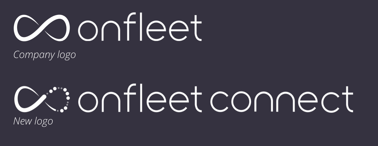
1.1 Original & new logo
03 newsletter
creating more modern assests to announce new product launch
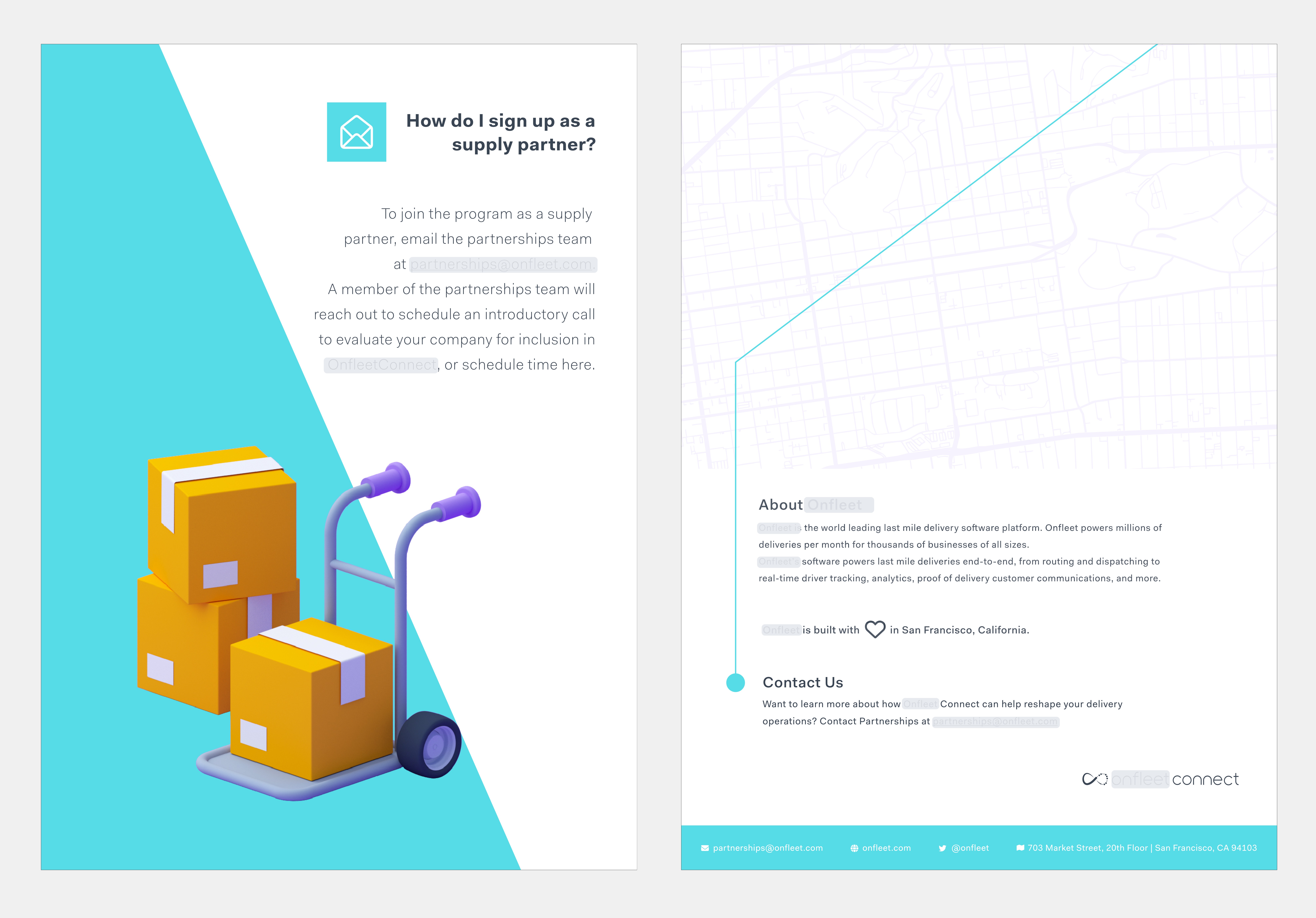
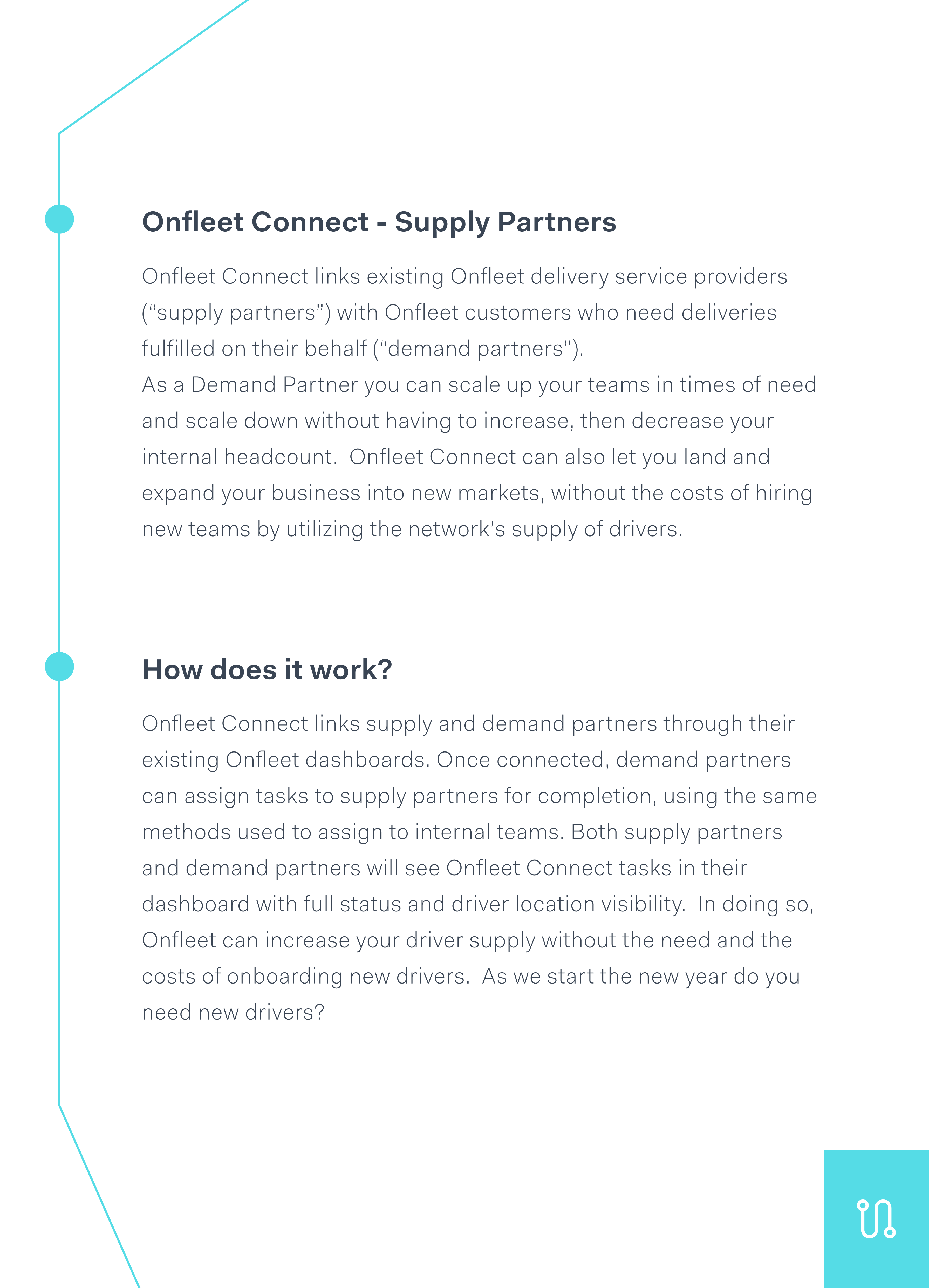
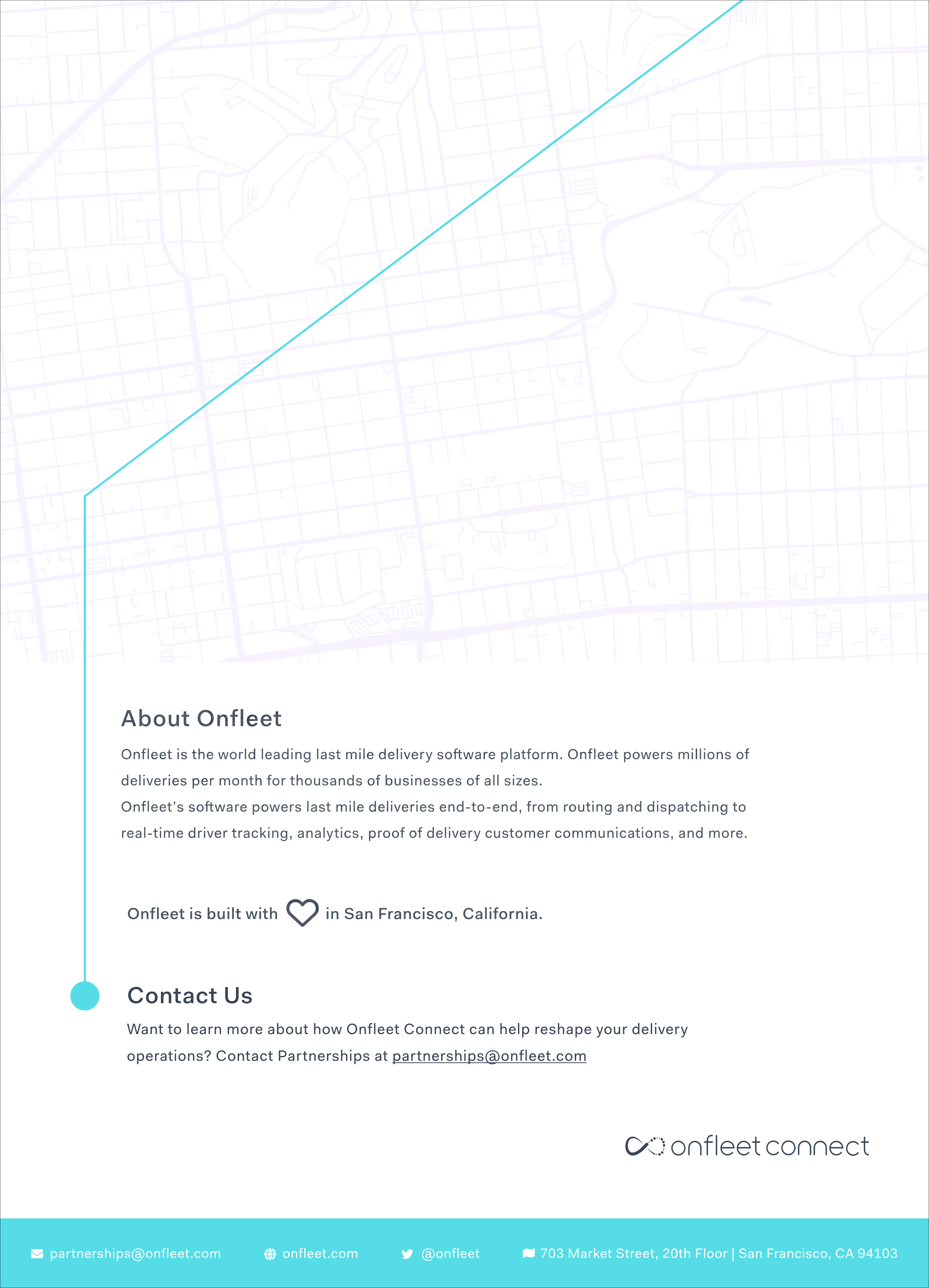
I designed assets for the newsletter announcing the launch of the new program. My main objective was to ensure that the assets captured the essence of the program while meeting the stakeholders' expectations. One of the main requirements was to give the brand a more modern and enterprising feel. To achieve this, I incorporated a new flow and design. The new patterns I created became part of the Brand Library.
I utilized a road-like line to establish a smooth flow between the pages, aligning with the theme of connections. This element is essential to the visual language and aims to enhance the user experience by providing a seamless transition between pages in the newsletter.

3.1 Newsletter 1st page
3.2 Newsletter 2nd page

3.3 Newsletter 3rd page
3.4 Newsletter 4th page
04 brand awareness research
conducting internal surveys and external research
My brand manager wanted to assess the value of a soft brand refresh to bring the overall look and feel of the brand up to date. We aspired to create a modern and clean aesthetic reflected in all assets. The first step was to evaluate the brand's current impression. I prepared a detailed spreadsheet of survey questions, which we reviewed asynchronously. We carefully selected the best ten questions for our internal survey, ensuring we could gather a proper mix of qualitative and quantitative data.
As an experienced UX researcher, I thoroughly enjoyed applying my research skills to this brand refresh project. Data-driven insights should inform a successful brand refresh. By conducting an internal survey, we gathered valuable feedback from our team members to help guide us in the right direction. This survey was just the first step in a larger project, and I am looking forward to continuing to apply my skills to help create a strong brand identity.

4.1 brand research survey
conclusion
Our efforts in refreshing the brand and launching the new side project were successful. We managed to simplify the brand and marketing design processes, allowing our colleagues to concentrate on other areas. The internal survey gave the stakeholders a sense of where the company was at. The stakeholders were very pleased with the results I produced.