Problem
I often heard people talk about the shame of killing their plants and the stress that creates. They typically have lots of houseplants but lack the confidence and know-how to care for them.
GOAL
To create an experience to alleviate the stress of plant care.
To address the shame and guilt perceived when peers talked about their lack of plant knowledge.
process
For this project, I followed the 5 Planes of UX methodology: strategy, scope, structure, skeleton, and surface.
I determined this was the best course of action to help me focus on my goal as well as align my activities to address the user experience consistently.
01 strategy
Defining user needs and business objectives
Determine what key pain points were contributing to the issue:
First wave: guerilla user research, being on a tight timeline. I had casual conversations with people at my workplace, cafes and parties. I inquired about how confident they were in their plant care skills and what routines they currently used.
Second wave: I conducted more formal user research by emailed surveys, user interviews, and scanning plant forums. I inquired further about what routines they currently used, how they determined their watering schedule and what were the emotional outcomes of losing a plant.
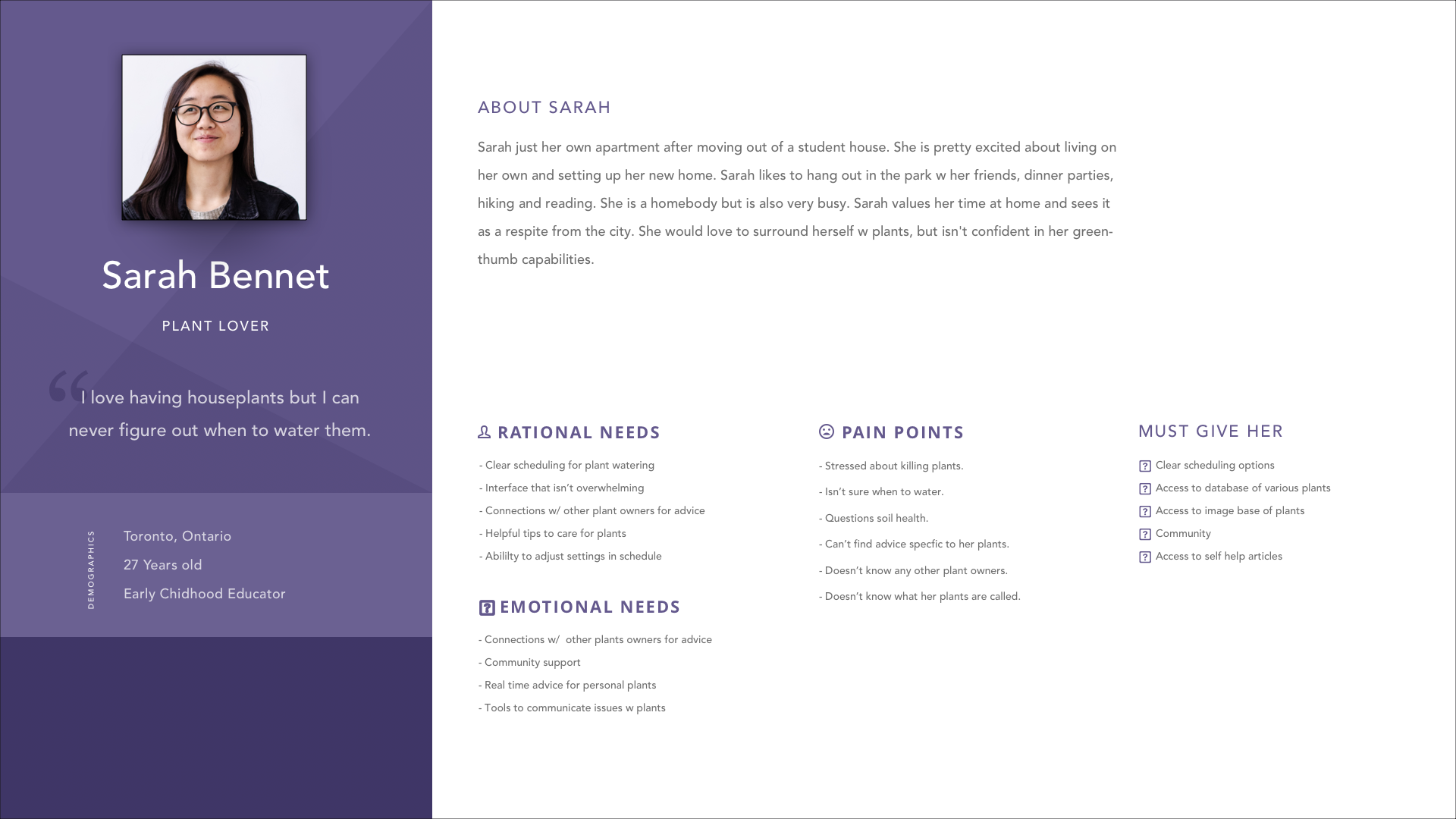
1 Persona was created to keep the project on track
02 scope
Defining functional and content requirements
Comparative/Field analysis: every app analyzed had a scheduling/calendar function, but didn’t offer any much-needed suggestions or prompts. The lacking feature would leave the user confused and second-guessing how to water their specific plant. There needed to be more intuitive features built-in for this app to serve its purpose of reducing cognitive load and alleviate stress.
I tested two apps with the functional requirements I was looking for; Plant Identification and Watering Schedules.
- 1) Waterbot:
- - scheduling feature was seamless
- - simplicity made it easy to use
- - usability was compromised due to this simplicity
- 2) Picture This:
- - utilizes camera phone to identify plants
- - plant identification feature very accurate
- - did not have any other features
03 structure
Interaction Design and Information Architecture
I created User Flows for a few critical tasks to ascertain what steps the user must take before creating the architecture of the app.
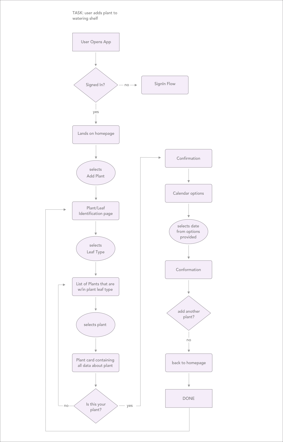
2 User Flow for task Add Plant to Shelf
CDesigning a sitemap helped me organize information and discover which features would be an asset to create the journey intended for the user.
Aligning with my persona and goals, I determined the features to be included needed to be:
- 1) plant Identification either by photo upload or searching easy to search list
- 2) watering and fertilizing suggestions based on species
- 3) scheduling capabilities based off app suggestions with the capacity to override and enter dates manually
- 4) connection to main calendars available
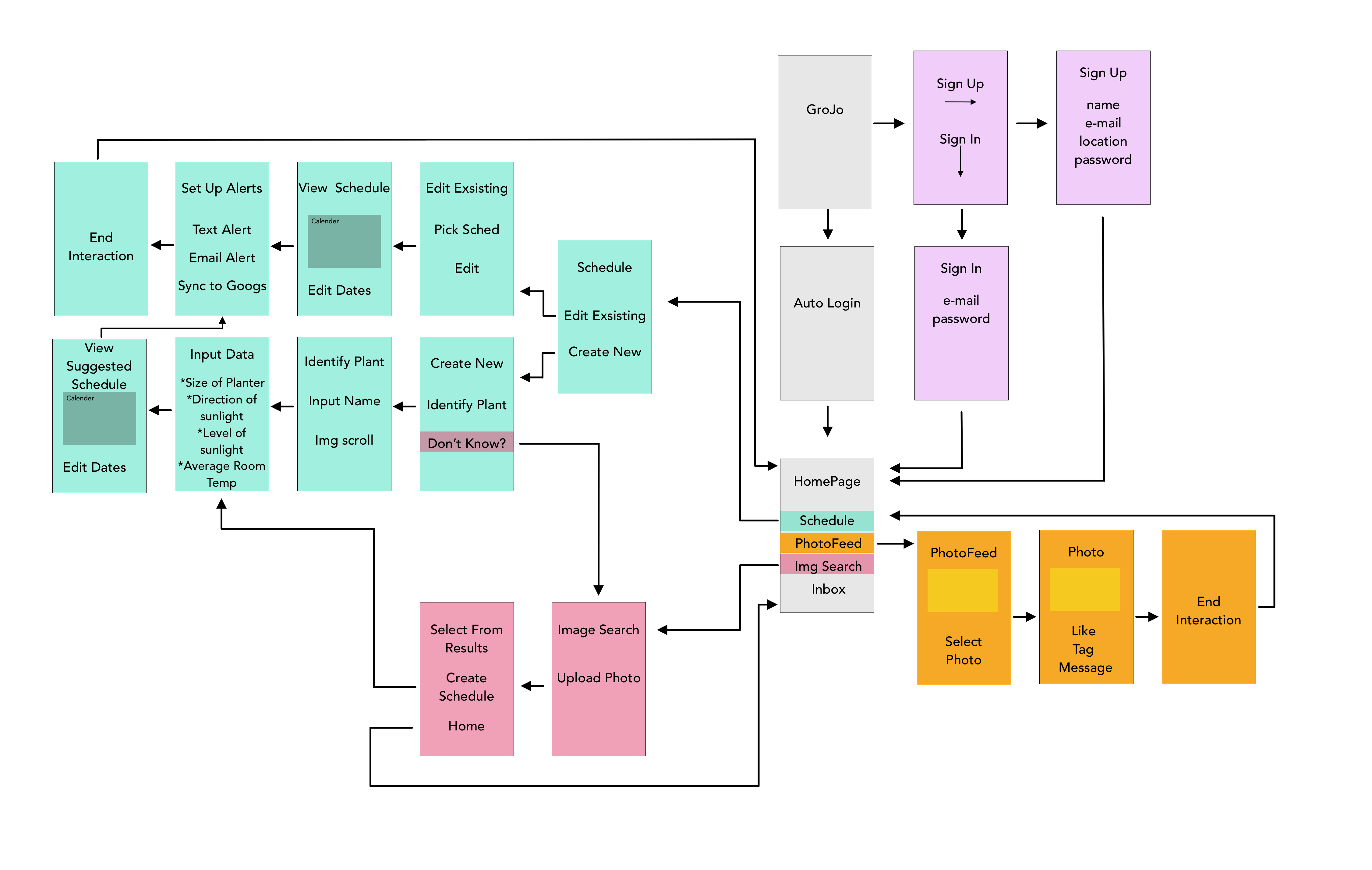
3 Site Map to stay organized
04 skeleton
Defining the visual form
Given the task-centric nature of the app, I deduced that many would-be holding their phone while watering their plants. I focused on the Thumb Zone for call-to-action buttons, task checkboxes, and more frequented menu items.
I created wireframes to organize and simplify my content and determine if there were any redundancies.
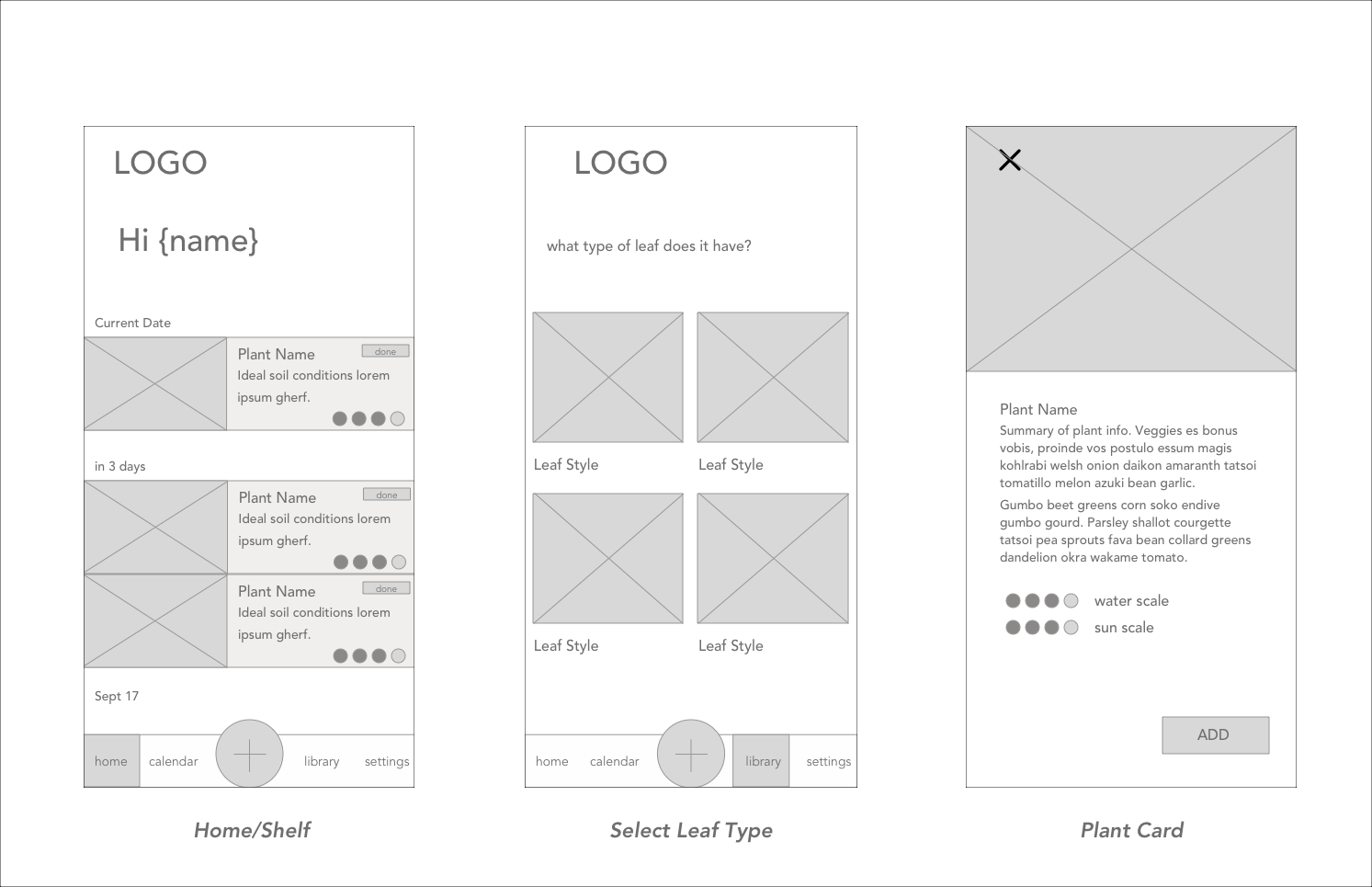
4 WireFrames
05 surface
Defining the visual style
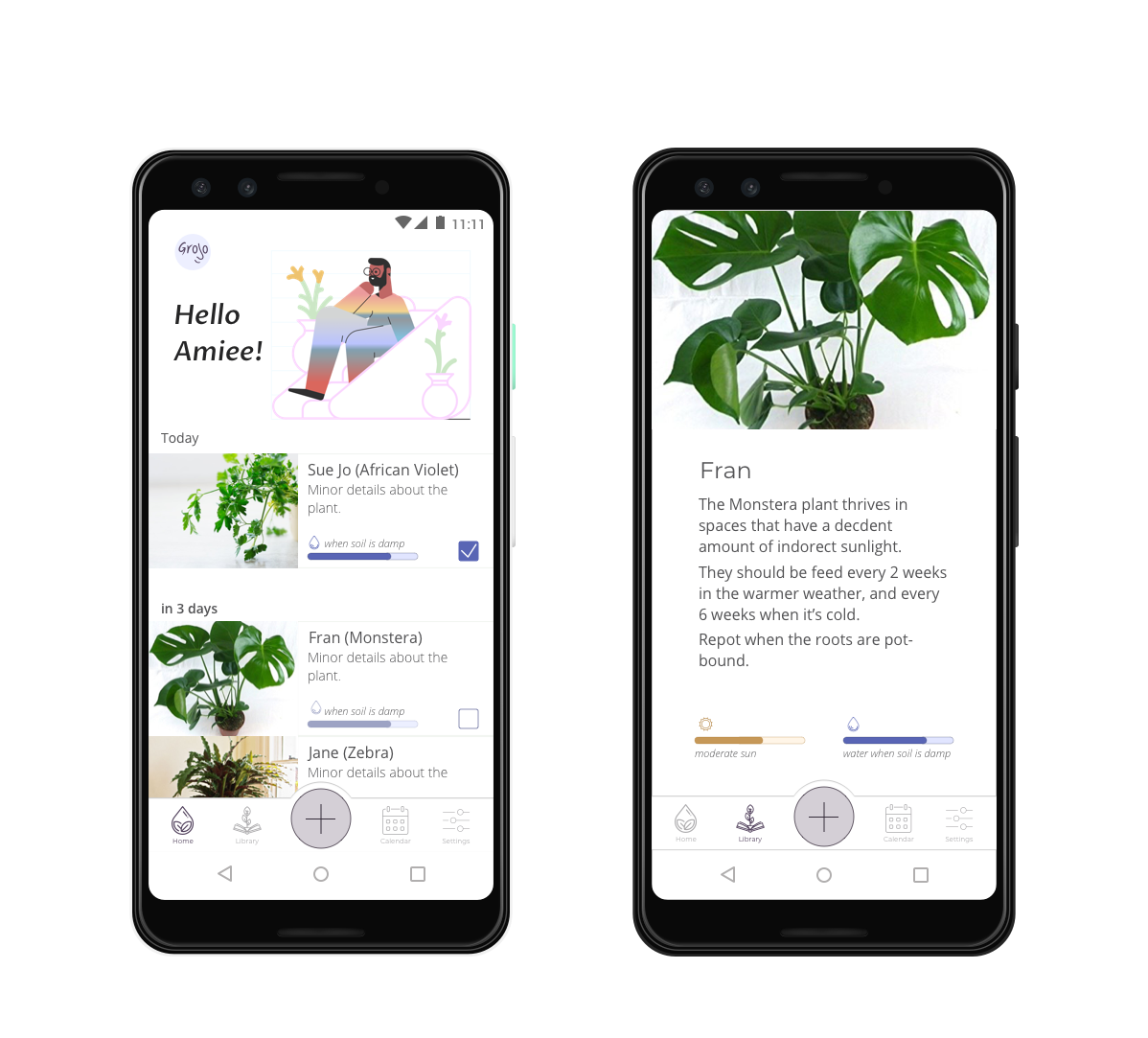
Watering houseplants is meant to be a meditative and enlightening feeling. I wanted the visual style of GroJo to reflect that, and still be fun and light. To accomplish this, I kept the colour scheme light and airy, and gave the UI elements plenty of space to breathe. The look is minimal so the plants can take center stage visually. To create some fun in the design, I used vectors from icons8 Ouch collection.
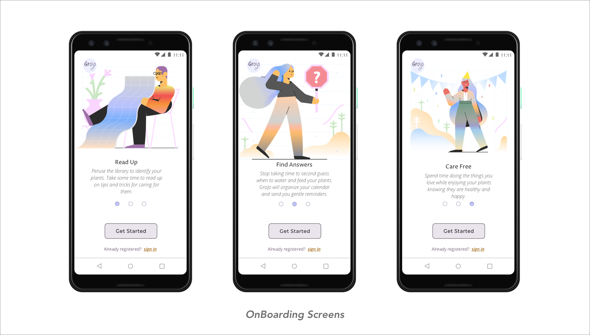
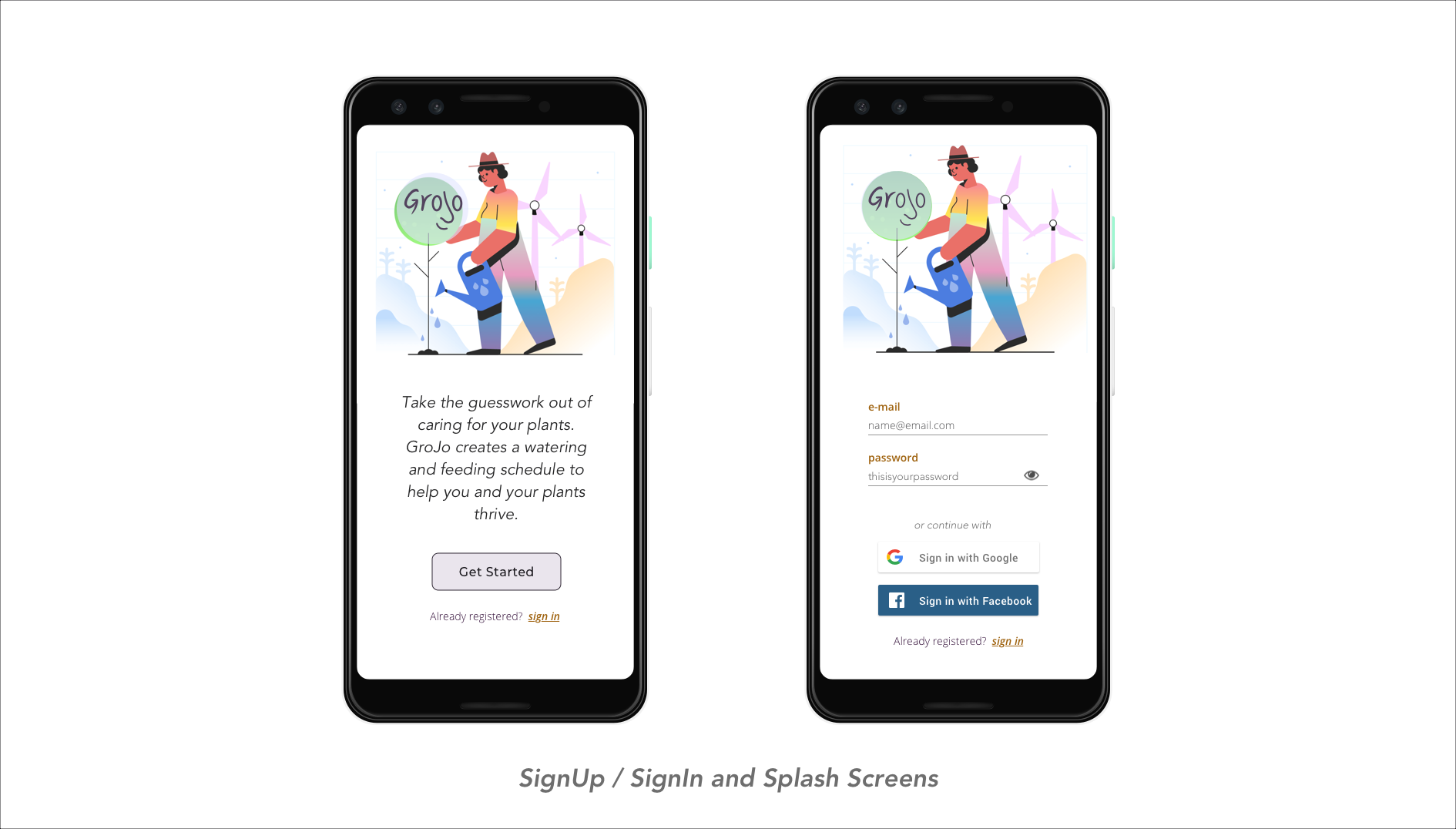
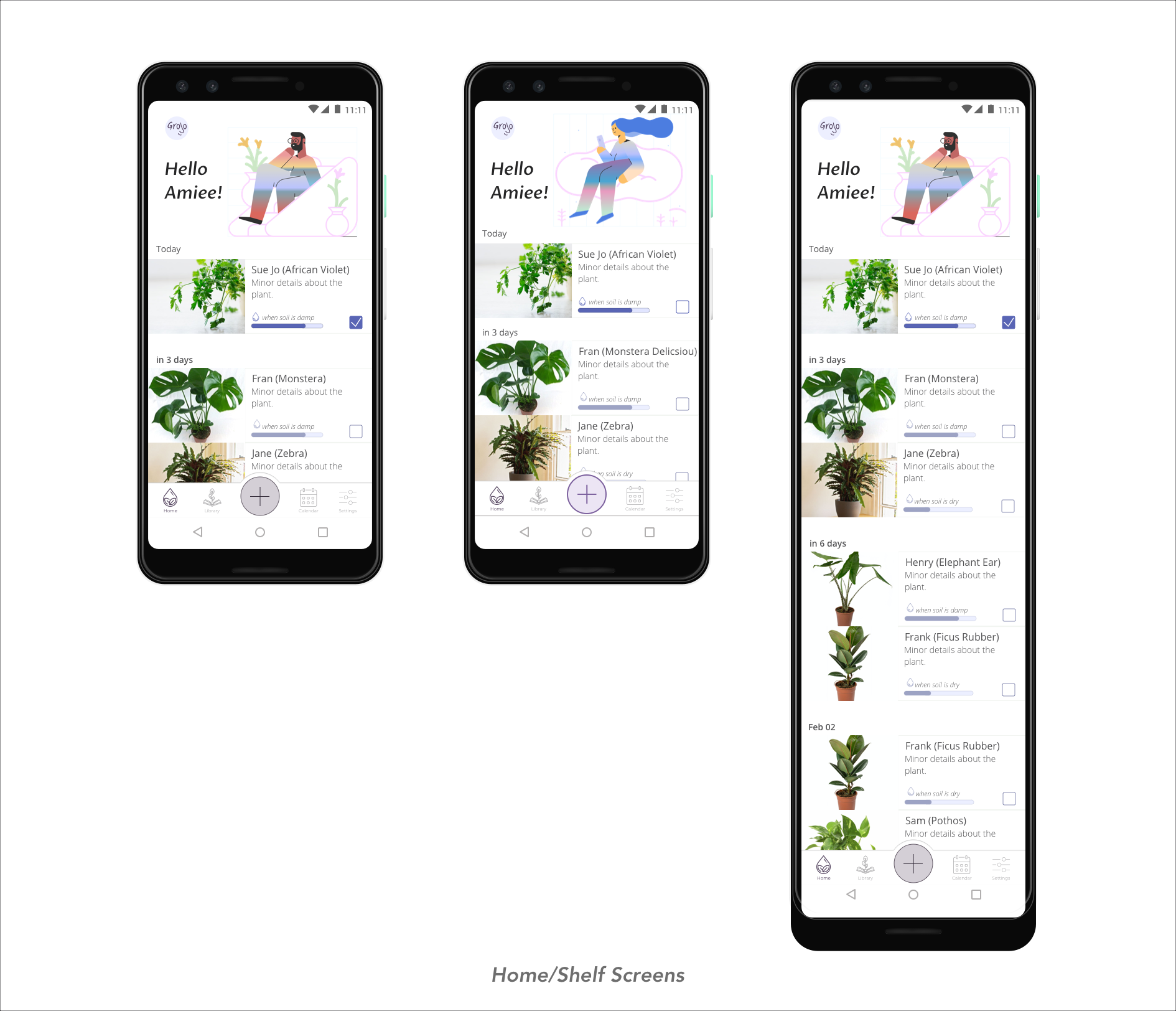
4 Final UI Screens
solution
The best take-away I got from this project is to simplify, then go back and simplify again. At the start of the project, I wanted to add a lot of features and functions. As the project went on, I realized it was just bogging down the experience. I stepped back and stripped out many of the extras.
GroJo is also the first project that I designed all the screens for. This process was highly valuable. I assumed I could soar through making all the screens given that I have such a strong design background. It took me many interactions to get the screens to get a sense of cohesion and the minimal UI I was aiming for. Another valuable lesson was understanding just how many different states the app could be in at any time, and all those states needed to be designed for. All in all, I learned a lot about the full process of designing a full app and all of its features.
future considerations
* More robust scheduling system: connect the Floral Feed and the Image Upload features into the scheduling flow. This will allow the User to move w/more ease as well as lessen the number of steps needed to set up a schedule.
* Integrate a Helpful Hints resource: GroJoe’rs can search for tips and tricks for their specific plants, ideally, there will be community moderators to communicate directly with. This will ensure the User can get access to as much information as possible w/out leaving the app.
* Extensive testing of scheduling feature: this project had a short timeline, which left little time for a deeper dive into the scheduling system. User testing to determine how much more extensive the Scheduling is useful, ie having a Text to Phone feature if photo integration would be useful.
* Return to the branding: the logo currently being used is more of a placeholder than a solid design decision. It is something I would be interested in revisiting when I learn more about graphic design.