Problem
According to Forbes, roughly one-third of the food produced in the world for human consumption every year — approximately 1.3 billion tonnes — gets lost or wasted. Food losses and waste amount to roughly US $680 billion in industrialized countries and the US $310 billion in developing countries.
Food waste is a growing concern for a lot of people, it has a negative impact from a financial, environmental, and emotional standpoint.
GOAL
To create an experience that will help reduce the amount of food waste produced by individuals in an urban setting.
process
For this project, I followed the 5 Planes of UX methodology: strategy, scope, structure, skeleton, and surface. I determined this was the best course of action to help me focus on my goal as well as align my activities to address the user experience consistently.
- Timeline:
- - first approached this project in 2017 during my first UX course with a 6-week timeline
- - initially focused on ways to help people stay organized to stay ahead of wasting
- - created FoodQueue as an organizational tool
When I received the opportunity to revisit the app, I took the opportunity to dive back into this project.
- Key goals:
- - Track my growth as a designer
- - Focus on the UI of the app
- - Refine and revise my research
Revisiting the research, I became aware of a pain point pattern. All of participants organized on the go, and even with all the organizational tools they were already utilizing, there was still a lot of food waste. Given that the app is intended to alleviate stress, I focused in on what to do with the food before it became waste. From there, the app pivoted into a trading platform for food items and leftover meals. This was also a great learning experience for me as I saw my biases in action, but also was able to see how my research skills had grown.
design iteration 01
01 strategy
Defining user needs and business objectives
I conducted User Interviews with 3 participants. Each interview was roughly 40 minutes. I determined at the time that a lack of organization was the most prominent contributor to food waste. The participants were in the habit of picking up groceries on their way home from work without using a list. This meant they often picked up items they already had on hand, as well as forgetting essential ingredients for the dish they wanted to make.
Utilizing the data I had gathered from the interviews, I constructed a User Persona to have a clear vision and let that guide my process.
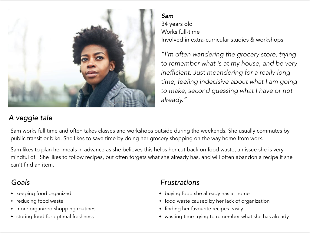
Persona
02 scope
Defining functional and content requirements
Comparative/Field analysis. The comparative research showed that not many apps had the recipe and grocery list integration. They often had 2 of the 3 features needed for optimal organization and integration. All of them were quite easy to learn to use and had a thorough on-boarding process.
03 structure
Interaction Design and Information Architecture
The Minimal Viable Product for Food Queue is an interactive grocery and pantry lists that the user can edit. Aligning with my persona and goals, I determined the features to be included needed to be:
- 1) Shopping List:: this is an essential feature for the user to stay organized and know what they need to purchase. The list will be editable and searchable, which will be useful for the user to have Food Queue adapt to their needs.
- 2) Recipe Integration:: having a space to store recipes as well as create shopping lists from them will be valuable in assisting the user in their organizational needs.
- 3) Fresh Tips:: this feature will help the user ensure the freshness of their food, which will help cut back on food waste. Ideally, there would be integrated directly in the shopping lists, which will make it easier for the user to store the food properly as soon as possible.
04 skeleton
Defining the visual form
User Testing
After creating a clickable prototype, I did user testing with 2 participants. I asked them both to perform 3 basic tasks.
Observations:
- 1) Users went directly to search function
- 2) Interface wasn’t intuitive
- 3) The experience was overly complicated
- 4) Too many options and paths to take
I determined I had been overzealous on my first attempt and the app became very confusing to use. As I had reached my timeline, I set the project aside until I could dedicate the focus to complete it.
design iteration 02
02 scope
Defining functional and content requirements
Time Constraints: As this was a design challenge, I had 72 hours to complete the project. Revisiting the data led to a new direction entirely, the app pivoted into a trading platform for food items and leftover meals.
All the people I interviewed previously envisioned themselves using the app at the grocery store or on the go. While the intention of the experience has changed, I determined many of the target audience will be using this app on the go.
03 structure
Interaction Design and Information Architecture
Content Strategy: To simplify the experience, I went with a three icon menu bar at the bottom of the screen. This is meant to be accessed with one hand, using the thumb as the main digit, keeping the other hand free for your basket or cart. This reduces cognitive-load, giving the user a very quick path into the different feeds. It also allows for an easier onboarding experience, an important aspect as many of the users are already dealing with anxieties about food waste.
Minimal Viable Product, I determined the key features needed to be:
- 1) Food Feed:: the listing of items up for trade.
- 2) Message Centre:: the user will need a space to communicate with the other user.
- 3) Upload:: a quick and easy way to upload food into the Food Feed
04 skeleton
Defining the visual form
For the aesthetic of the Food Feed, I followed the advice of Master Chefs; always give the food it’s respect. This is translated into the clean UI and light colours. The image of the food is meant to take centre stage and speak for itself, this also allows the user to scroll quickly through the feed when looking for ingredients. As there was a time constraint, I started the palette and UI choices in conjunction with the wireframing.
After working out the architecture of the app, I created high-fidelity wireframes to be used in the hi-fi prototype. As was determined by the brief of the design challenge, I created 3 User Flows using inVision.
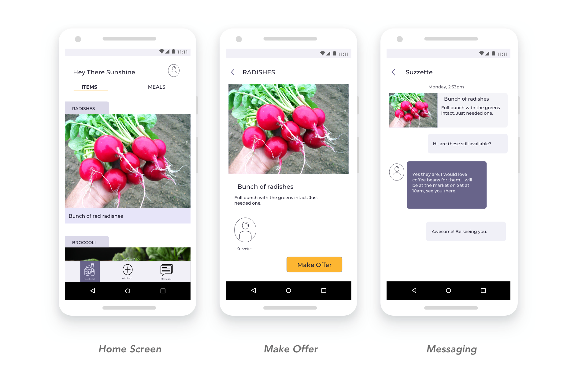
I determined the most predominant flows would be:
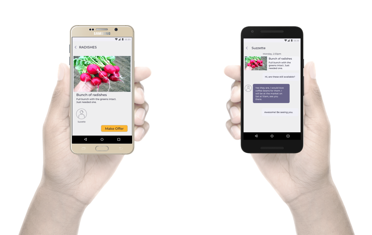
- 1) Post an Item:: the key function of the app, it needed to be easy to accomplish with one hand.
- 2) Make an Offer:: another key function, a simple means to make an offer on an item of interest.
- 3) Messaging a User:: giving the user access to the messages to set up meeting times and further bartering.
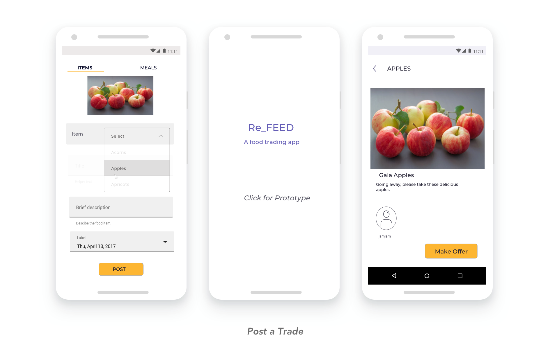
Clickable Prototype
05 surface
Defining the visual style
When designing the colour Pallete, I went w Purples/Lilacs as the colour signifies abundance and pleasantries. I wanted this experience to lend itself to the feeling of abundance. The type is easy to glance at and has a calming effect.
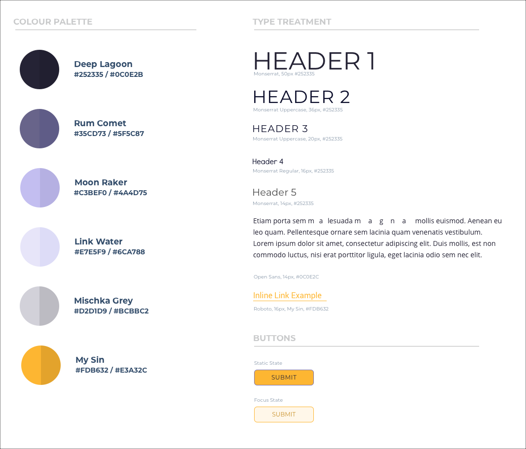
Style Tile
Every item or meal listed has a Food Card, where the user can get the relevant details about the item and start an interaction to trade. Many of the items being traded are perishable, gaining the users' trust is essential to them having a positive experience. The soothing colour scheme and nostalgic recipe card design speak to this. The Freshness Scale is meant to soothe the mind of the user, as well as convey important information quickly.
Final UI
solution
Re-Feed a food trading/give-away app. The goal of this process was to create an experience that alleviates the pressure of food waste and the shame involved. My intention was to create a positive experience during an act of good, while reinforcing positive behaviors, and enthusiastically engaging users in creating more sustainable food habits.
I learned a lot during this project, my most valuable lesson was to set aside my own biases while examining the research. I also discovered my deep love of research.
future considerations
- * Creating more of a community
- * Recipe integration/upload: user inputs recipe and Re-Feed searches for relevant ingredients
- * Proactive trading, getting supplies before you go shopping, searches for items in your list
- * Starting groups and communities, creating a marketplace to display
- * Creating a Shelf in the app, to see all the food the user has
- * Option to see other shelves w/in your location
- * Revisit UI